To design a simple yet intuitive onboarding journey with the flexibility to meet the diverse range of user needs.
Outcome: Create a better user experience while also improving conversion and NPS.

Requirement gathering and analysis
The opportunity
While improving conversion rate would bring benefit to our charities, making the overall experience better had the potential to improve customer satisfaction and loyalty that would encourage repeat activity.
The challenge
The constraints of the backend system did bring some restrictions to how far we could push this project along with the limited budget and resource that comes with being a not-for-profit organisation.
The proposition
Customisation
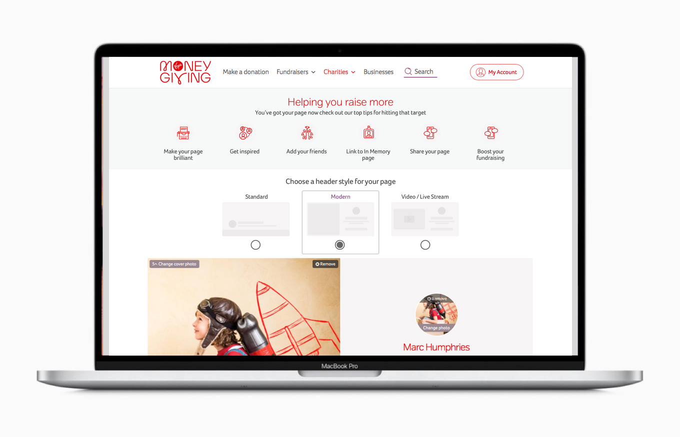
The existing journey asked the user a range of questions and forced them to choose the type of fundraising there were doing up front. The overarching principle was simple, what was the minimum amount of information we needed to create a user a fundraising page and allow them to start collecting donations for the cause they wanted to support. Enhancing and customising the page to meet their specific needs could come later supported by a range of tools and guides to help them inspire their supporters and share the story behind their reason for fundraising.
Balancing the requirements
It was essential to strike the right balance between the proposition and the data we needed to gather as a business, and exiting backend system, as well as ensuring we could provide the data our charity customers expected from a fundraising platform.
Building for the future
The bigger picture
With a simple onboarding journey the path to future enhancements of the product offering was clearer. Following the principles of the previous design it would have been feasible to see that as new features were developed additional questions would have been added to the initial page or account creation journey. With the new principles in place the core journey would, in the majority of instances, have been able to remain simple with the customer choosing how to customise their new page at a later date.